
Still making decisions from scattered reports?
Share your data sources, reporting process, and the decisions your team needs to make. We’ll map a cleaner dashboard path with trusted metrics, filters, and role-based views.
Dashboards & Data Visualization
Stop guessing what your business data is trying to say
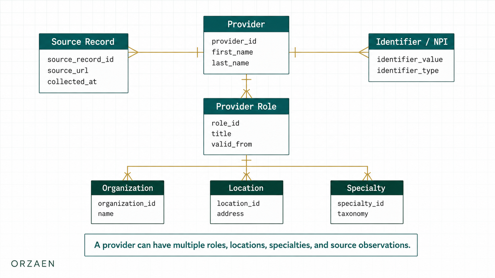
Your team should not chase spreadsheets, exports, and disconnected reports to understand performance. We build dashboards that connect your data sources, clean the numbers, and turn key metrics into views your team can actually use.
Where reporting starts slowing decisions down
Most teams are flying blind. Critical business metrics are buried in spreadsheets that are updated weekly if at all. Decisions are made on gut feeling because getting real-time insights means wrestling with five different tools and a BI system nobody knows how to use.
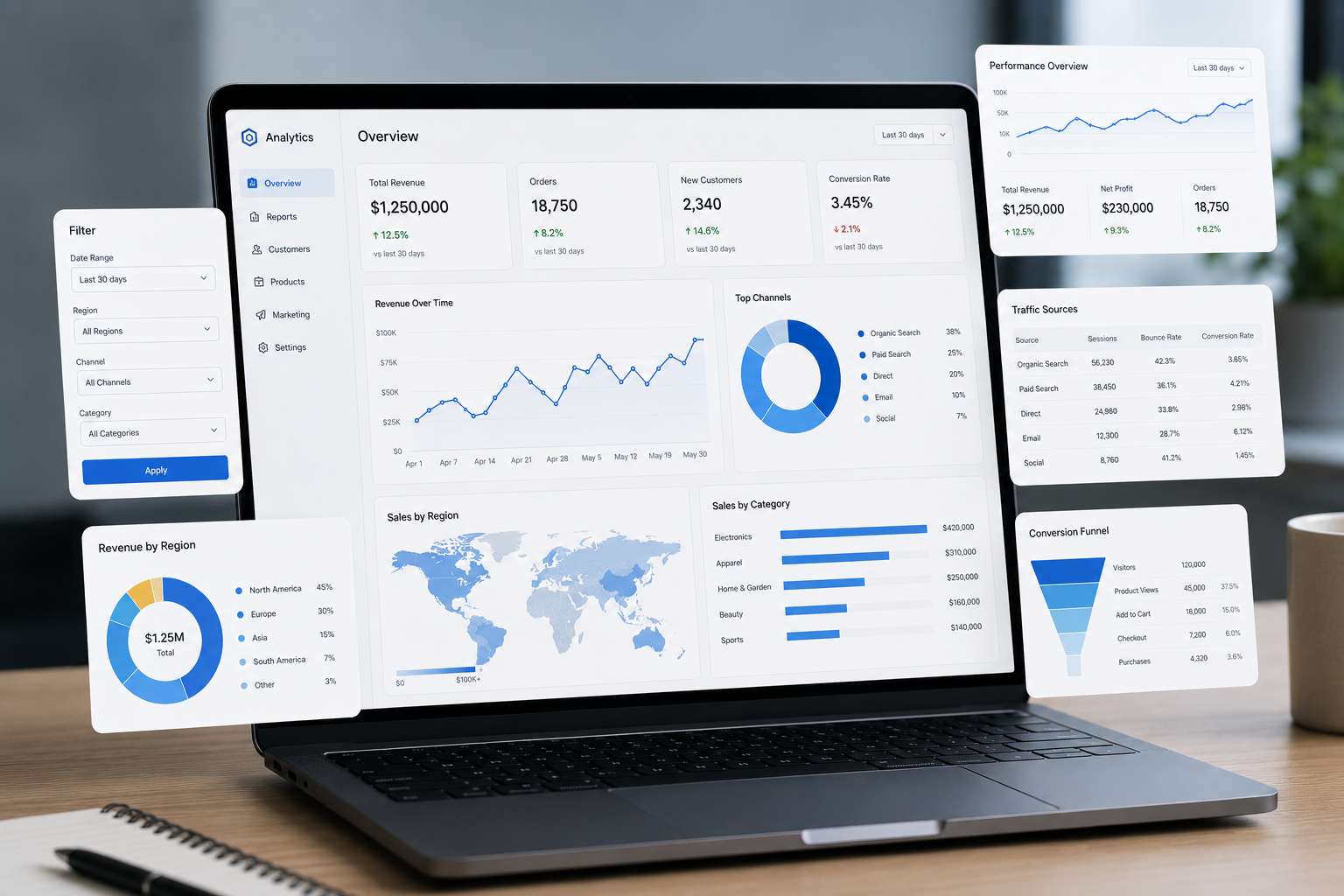
Dashboards built for decisions, not decoration
Orzaen builds custom dashboards and data visualization systems that surface the metrics that matter, updated in real-time, accessible on any device. We connect to your existing data sources and present insights in a way that drives action.
We use modern visualization frameworks with server-side rendering for fast load times and real-time WebSocket connections for live data. Every dashboard is designed around the decisions your team needs to make, not just the data you have.
Client Feedback
“Wonderful to work with, knowledgable and kind! Great work!”
Karah S. / CRM Operations Manager, MarketSurge User
Dashboard Preview
Google Maps data shaped into a clean reporting workspace
A less boxed dashboard preview using real local business fields: business name, category, location, rating, reviews, phone, website, and review text signals.
Local Business Intelligence
Open report view · filtered by category, state, and review signals
Places
12
Reviews
7.2K
Rating
4.7
Ready
10
Reviews by Category
Total review volume grouped by category
Rating Mix
Distribution of rating buckets
Contact Coverage
Phone and website availability
| Business | Category | State | Rating | Reviews | Status | Signals |
|---|---|---|---|---|---|---|
Smile Studio of Spring Lake Spring Lake, NJ | Dentist | NJ | 4.9 | 384 | Ready | friendly staff86clean office74implants42 |
Miami Dental Care Miami, FL | Dentist | FL | 4.6 | 529 | Ready | clean office93insurance72whitening54 |
Orlando Pediatric Dental Orlando, FL | Dentist | FL | 4.9 | 477 | Ready | kids133insurance67gentle care89 |
Brooklyn Pet Grooming Brooklyn, NY | Pet Grooming | NY | 4.7 | 812 | Ready | gentle care144same day98puppies77 |
Nashville Vet Clinic Nashville, TN | Veterinary | TN | 4.8 | 584 | Ready | emergency86pet care121friendly staff97 |
Austin HVAC Pros Austin, TX | HVAC | TX | 4.8 | 641 | Ready | fast repair126AC service111technician94 |
Dallas Roofing Experts Dallas, TX | Roofing | TX | 4.6 | 351 | Ready | storm damage74inspection59insurance51 |
Insight View
Switch between repeated review language and location demand across the filtered dataset.
Keyword mentions
What this means
These phrases come from review snippets or review text. They help show what customers repeatedly mention.
Reporting Barriers We Remove
The gaps that make teams stop trusting their numbers
We turn scattered spreadsheets, unclear KPIs, stale reports, duplicate data, manual exports, and confusing visuals into dashboards your team can read, filter, and trust.
Leadership
Important numbers are scattered.
Our Solution
One clear view shows what needs attention.
Sales
Pipeline updates are hard to track.
Our Solution
Leads, deals, follow-ups, and wins stay visible.
Marketing
Campaign results are hard to compare.
Our Solution
Traffic, spend, leads, and conversions sit together.
Operations
Workload problems are noticed too late.
Our Solution
Delays, queues, and exceptions show up early.
Finance
Revenue and cost reports take too long.
Our Solution
Payments, invoices, spend, and margins stay organized.
Support
Customer issues hide inside tools.
Our Solution
Tickets, calls, backlog, and response time become visible.
Product
Usage signals are hard to understand.
Our Solution
Feature activity, users, and drop-offs become easier to read.
Data Team
Teams question which number is correct.
Our Solution
Sources, formulas, and update rules are documented.
Leadership
Important numbers are scattered.
Our Solution
One clear view shows what needs attention.
Sales
Pipeline updates are hard to track.
Our Solution
Leads, deals, follow-ups, and wins stay visible.
Marketing
Campaign results are hard to compare.
Our Solution
Traffic, spend, leads, and conversions sit together.
Operations
Workload problems are noticed too late.
Our Solution
Delays, queues, and exceptions show up early.
Finance
Revenue and cost reports take too long.
Our Solution
Payments, invoices, spend, and margins stay organized.
Support
Customer issues hide inside tools.
Our Solution
Tickets, calls, backlog, and response time become visible.
Product
Usage signals are hard to understand.
Our Solution
Feature activity, users, and drop-offs become easier to read.
Data Team
Teams question which number is correct.
Our Solution
Sources, formulas, and update rules are documented.
Services
Dashboard and reporting work we build around real business decisions
Executive KPI Dashboards
High-level business metrics with real-time updates. Revenue, conversion rates, customer acquisition cost, lifetime value, and custom KPIs. Designed for leadership teams who need to see the big picture at a glance with drill-down capability.
Operations Monitoring Dashboards
System health, process metrics, team performance, and operational KPIs. Alert integration for anomalies. Used by operations teams to spot issues before they become problems and track efficiency improvements.
Sales & Marketing Analytics
Pipeline visualization, funnel analysis, attribution tracking, cohort analysis, and campaign performance. Lead scoring dashboards with conversion tracking from first touch to close.
Financial Reporting Dashboards
P&L visualization, cash flow tracking, expense breakdowns, revenue recognition, and budget vs. actual analysis. Automated report generation and scheduled email delivery to stakeholders.
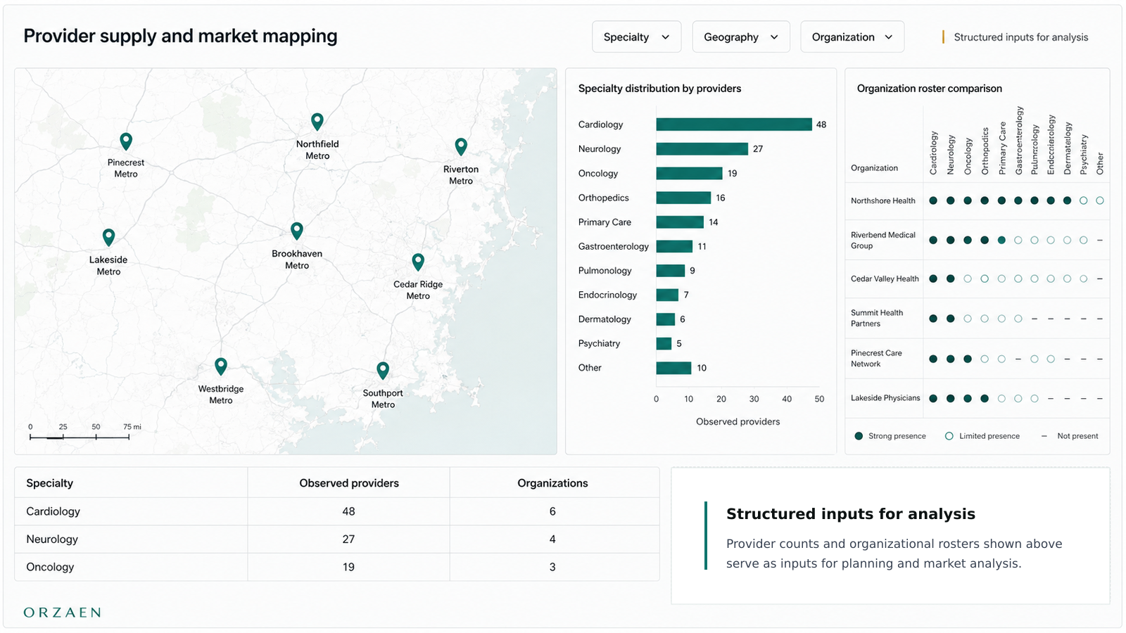
Geographic & Location Analytics
Interactive maps with territory performance, location-based metrics, heatmaps, and regional comparisons. Filterable by time period, product line, and demographic segments.
Use Cases
Where clear dashboards remove daily guessing
Data Sources We Connect
Business tools, databases, files, and APIs we turn into trusted reporting views.
Source Registry
Databases
Approach
We connect structured business data from production databases, reporting tables, and internal tools.
Output
Fast dashboard views with clear joins, filters, trends, and metric calculations.
Examples
PostgreSQL, MySQL, MongoDB, MariaDB, SQLite, Supabase
Chart Library
Charts selected for clear business decisions
Clean visual formats for trends, rankings, shares, density, relationships, and funnels.
Line Chart
Track movement over time.
Bar Chart
Compare categories clearly.
Donut Chart
Show share and distribution.
Heatmap
Spot dense activity patterns.
Scatter Chart
Compare two numeric signals.
Funnel Chart
Follow stage drop-off.
Manual reporting
- ×Reports rebuilt by hand
- ×Numbers copied between sheets
- ×Different teams use different formulas
- ×Old exports keep circulating
- ×No clear owner for each metric
- ×Charts do not explain what to do next
With Orzaen control
- ✓Reports pull from connected sources
- ✓Recurring updates happen automatically
- ✓Metric definitions stay consistent
- ✓Freshness is visible
- ✓Each metric has a source and owner
- ✓Views guide decisions and next steps
Reporting Control
Stop treating spreadsheets like your reporting system.
We replace scattered manual reporting with controlled dashboards that make ownership, freshness, filters, and metric definitions clear.
A dashboard should make the number, source, owner, and update rule obvious before anyone acts on it.
Dashboard & BI Stack
Built with tools for data connection, modeling, visualization, and sharing
We choose databases, BI tools, APIs, spreadsheets, warehouses, frontend frameworks, and automation tools based on your data sources and reporting needs.
01
Dashboard Platforms
BI dashboards, reporting portals, executive views, and internal analytics screens.
 Power BI
 Tableau
 Looker Studio
02
Dashboard Data Stores
Clean reporting tables and query-ready data used behind dashboards.
 PostgreSQL
 Supabase
03
Data Preparation
Cleaning, joining, shaping, and validating data before charts are built.
 SQL
SQL Python
 Pandas
 dbt
dbt04
Custom Visuals
Custom React dashboards, charts, filters, tables, and interactive data views.
05
Reports & Exports
Spreadsheet reports, CSV exports, PDF snapshots, and scheduled dashboard handoffs.
 Google Sheets
Delivery Workflow
How we move from scattered reports to trusted dashboards
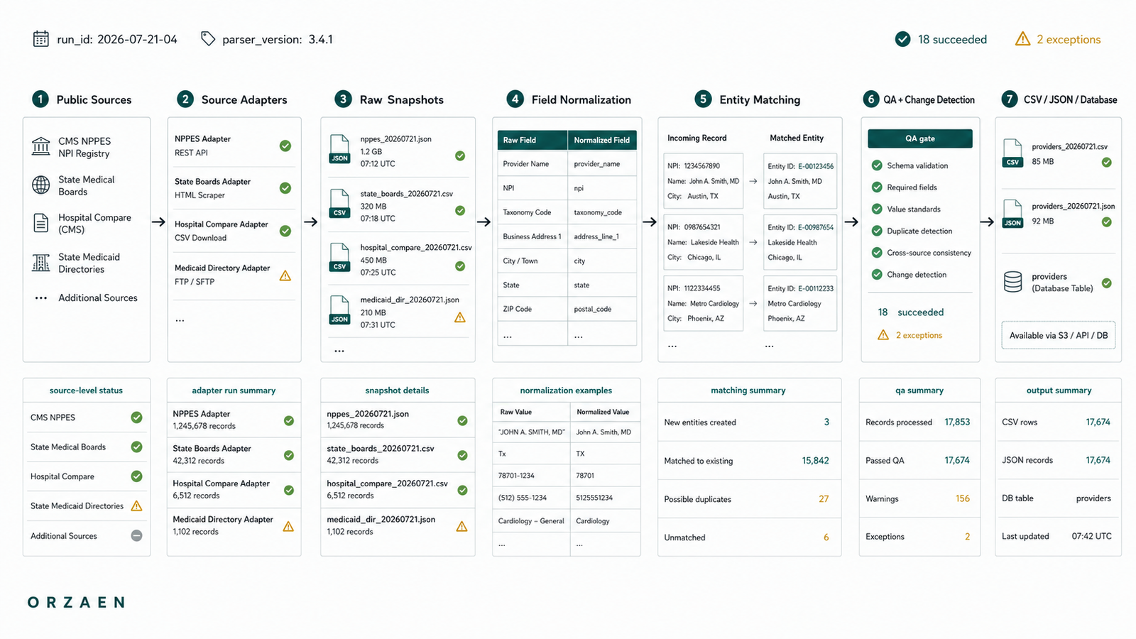
We review the reporting process, connect data sources, define the metrics, design the views, build the dashboard, test accuracy, and hand over a reporting system your team can use.
Review the reporting problem
We identify the users, decisions, current reports, data sources, manual steps, and numbers the team does not trust.
Collect the data sources
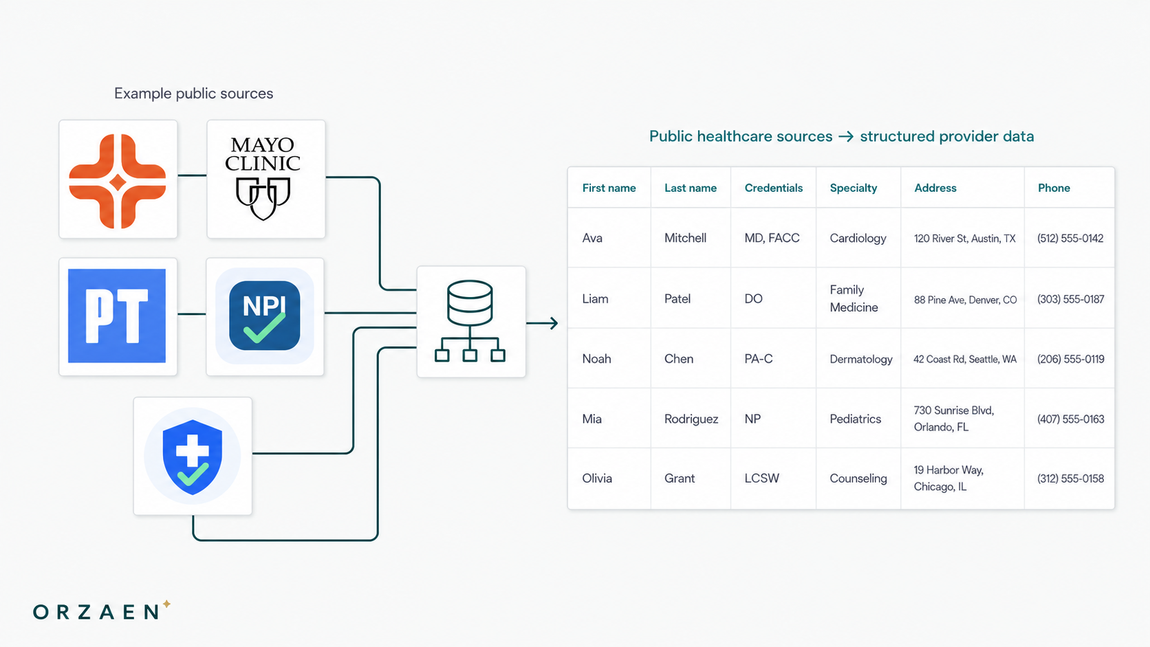
We connect scraped datasets, CRMs, spreadsheets, APIs, databases, automation logs, files, or business tools.
Clean and shape the data
We remove duplicates, fix formats, map fields, normalize labels, validate records, and prepare dashboard-ready tables.
Define the dashboard views
We design views for leadership, sales, operations, finance, support, or data teams based on how they work.
Build charts, filters, and exports
We add scorecards, tables, charts, filters, alerts, CSV/Excel exports, PDF reports, or Google Sheets outputs.
Test and hand off
We compare numbers, test filters, check refresh rules, document sources, and hand over usage notes.
Controlled Workflow
Each step connects sources, metric definitions, filters, refresh rules, permissions, visual hierarchy, exports, and handoff notes into one controlled reporting workflow.
FAQ
Questions clients ask before building dashboards
Still have questions? We typically respond within 2 hours.
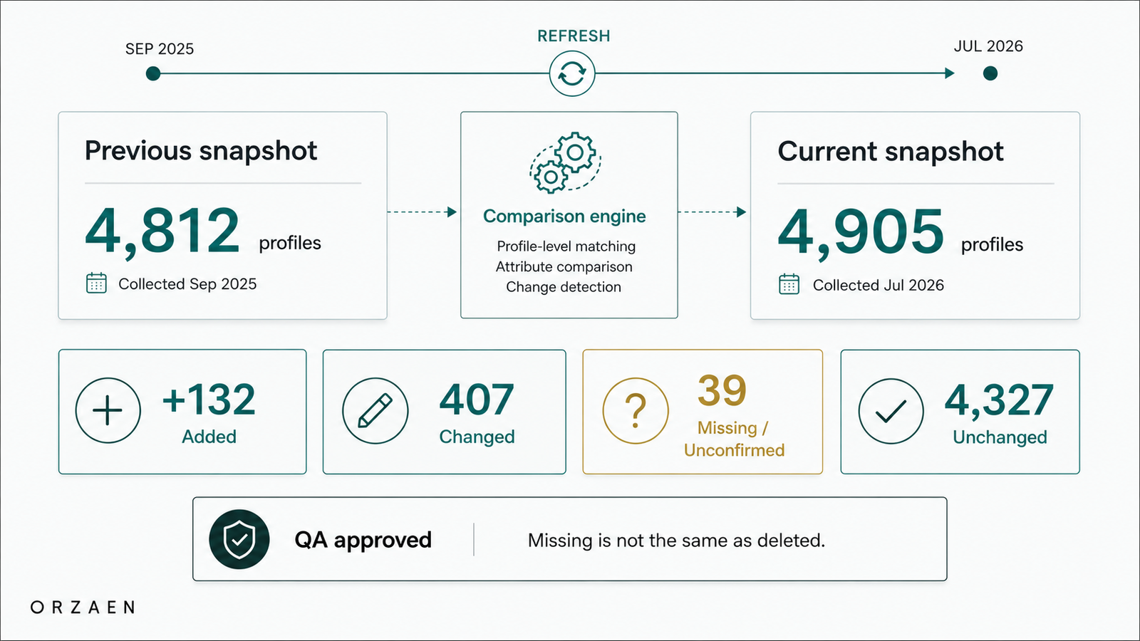
Automation Field Notes
Lessons from building automation that runs in production
Request a Quote
Turn scattered reports into dashboards your team can trust
Send your data sources, current reports, spreadsheets, KPIs, team roles, and decision points. We’ll review the best dashboard structure for your workflow.
No perfect brief needed.
Project Brief